UX-Designer with an aestethic set of mind.
Welcome to my portfolio!
I focus on creating design concepts and experiences that empowers people and solves real-life problems.
My passion is user-research, game design and gamification.
I see it as a big part of the future and we've only seen the tip of the iceberg yet. - The game has just begun.
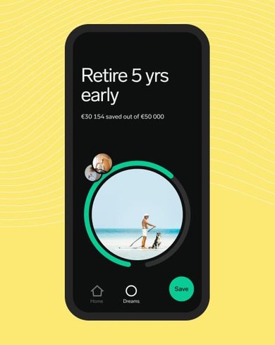
My team and I re-designed and added features to the existing page in order to help users complete their profiles and to make them understand the value proposition of the platform.
My team took on the mission to make the company increase their revenue but at the same time, gain knowledge about their customers.
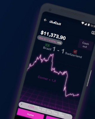
I created a UI concept with user centered design for a mobile betting platform.
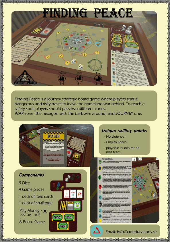
Designed an educational board game for the organization World Beyond War, which is available on the steam platform.
Our game is a part of several human rights modules and has a central role in the world refugee day module which takes place in many different schools in Ireland.
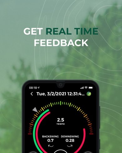
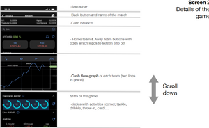
We designed features and improvements towards an golf application accordingly to our research.
The end delivery is confidential due to an NDA.
As UX Designers we came in two weeks after their launch, hence, there was not much data to go on. In this short period of time stakeholders at AreaChica saw three areas of their service that needed to be solved.
One of these areas was the registration process and the completion of a company profile in their showroom;
AreaChica clients get access to the platform in a self-onboarding process. Clients must register basic company and personal information to get started. Thereafter the client must complete their own profile and build their Showroom. What we see is that clients start to build their Showroom but without completing the necessary info.
This gives us a problem as the Showroom looks half done and we have to manually contact the client and help them. How do we engage the user to 100% profile and Showroom completion during the registration process?
Info:
Customer: AreaChica AB
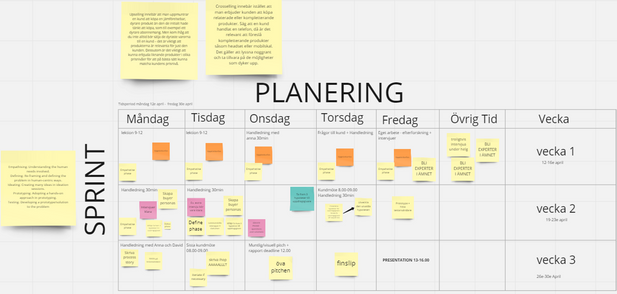
Sprint scope: 3,5 weeks.
Team: Five UX-Designers.
Role: UX-Designer, Project lead, Researcher.
My responsibilities:
Info:
Customer: Dreams AB.
Sprint scope: 3 weeks.
Team: Five UX-Designers.
Role: UX-Designer, Project lead, Researcher.
My responsibilities:
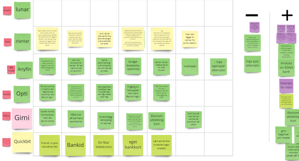
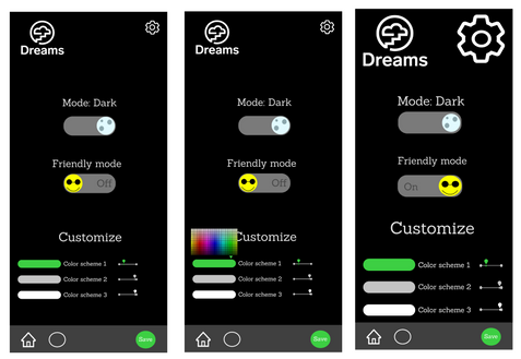
This solution is so simple but yet brings an really personal touch for your experience while using the application.
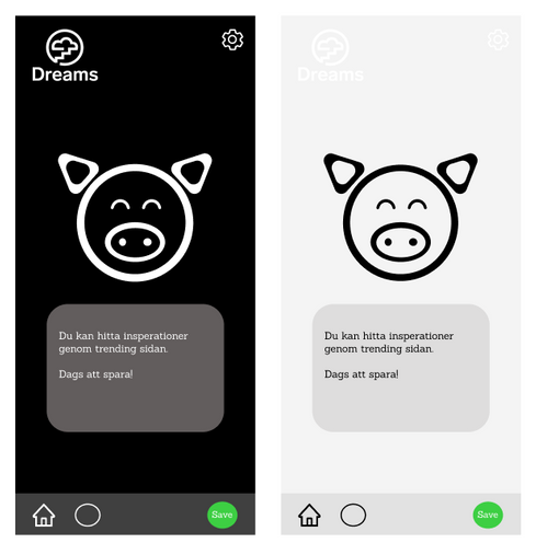
We introduced light/darkmode so that the users is able to change how the app looks for them.
We also introduced "friendly mode" which makes fontsizes bigger for anyone with vision impairments.
There were several users during the qualitative user-research who mentioned the colors scheme and felt like it was annoying or would like a less wearing color scheme and that's why we saw this solution as a must!
Mascot marketing has been used successfully by many huge companies around the world to boost profits, improve brand recognition and drive sales.
The main purpose of mascot marketing is to strengthen the brand identity.
The mascot will help Dreams to create and strengthen Dreams brand story, leaving a lasting memory with the users.
By creating a story and a character that the users can identify with, the users will feel a part of Dreams, and, as a result, will be far more likely to purchase their product or service. Thats why we created the Dreams mascot "Spargrisen". ("Piggybank")
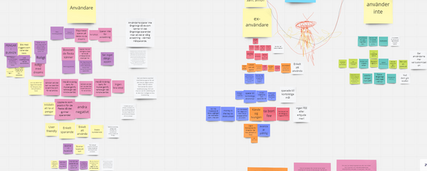
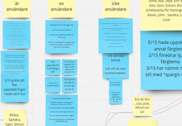
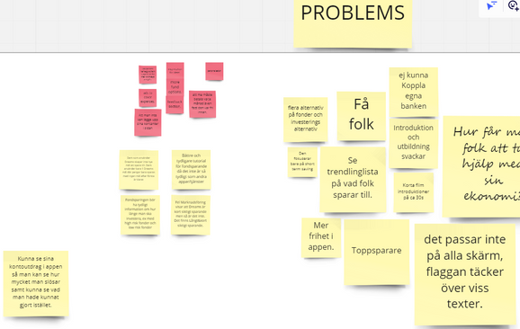
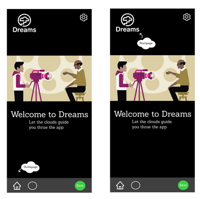
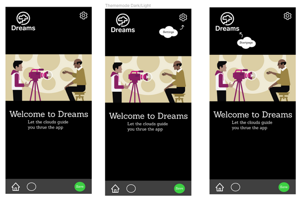
Another problem that was an insight and mentioned through several interviews, were, that many people who wasn't that familiar with dreams had not seen all of the feautures that users who was familiar with dreams, loved and used frequently.
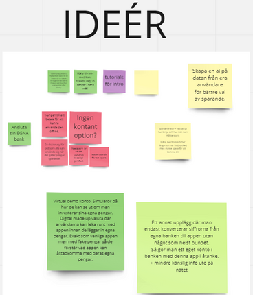
These features was in the shadows and we understood that with an easy tutorial which explores all the aspects of the application and its features, would highlight the benefits of the app, and would make users and non-users to understand the true value of what Dreams can do for your financial well-being.
The theme for this game project came from World Beyond War (Links to an external site.).
The brief was that the game should simplify - yet be able to reflect quite accurately - the effects to the people when governments invest in warfare instead of infrastructure, and vice versa.
The game should carry educational / learning points, but be engaging enough and replayable.
It should also be able to serve as a tool to help decision makers make better choices that will benefit the people and thus, the country.
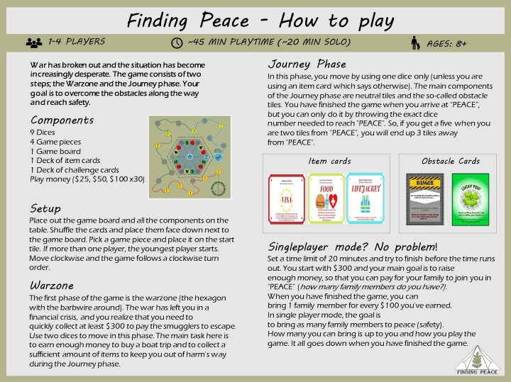
- Be playable Solo and by 2-4 players.
- There should be BOTH PvP(Player-vs-Player) AND Co-op(Cooperative) modes to our game.
- A full session should average 25 - 30 mins of play time. It should not take less than 15 mins for a game to complete.
- Should take no more than 15 mins to learn the rules and set up the game. You should also be able to learn the game by jumping right in.
Info:
Organisation: World BEYOND War
Game design scope: 4 weeks.
Team: Five design students.
Role: Game lead designer, Concept creator, User tester, Prototyper, UI artist, Researcher.
My responsibilities:
Due to the openess of the mission were we required to do our own research about which area of the effects of war we would focus our game on.
We went straight away to do the research, and were supposed to share our insights and idéas first thing in the morning after.
When we gathered for our group session did I suggest we should focus about refugees, because it's a common denominatior throughout all wars, and throughout all history.
I also presented some horrific statistics about refugees in the world today (mainly from UNHCR as a source).
It was consensus and we continued to build on that idea.
It was in this step I became the game lead designer due to the lack of game experience from the rest of my project group.
We was working remotely so we all got the tabletop simulator from the steam platform, in that way could we collaborate in an realistic enviroment togheter and we played around a bit to make everyone comfortable with the tools we was going to work with alot the upcoming weeks.
We started to ideate how and what could be done to educate the masses around a refugee journey.
We tried to emphasize and imagine how a refugees journey could take place according to our research.
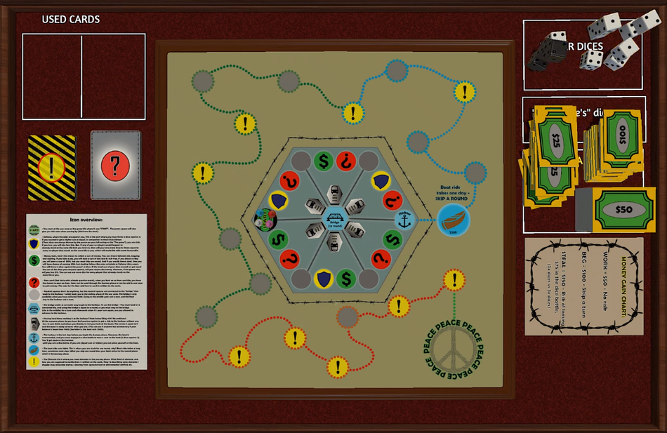
We agreed upon having two parts in the game one where there is a war zone where you start and the journey zone where you have to make it outside. We agreed that money was the most important asset to have to have a chance to get out from the war zone. We agreed on several ways to earn money and mechanics how to use them and loose them. We came up with mechanics that we could use as Co-op elements and PVE elements. The PVP elements is naturally infused as one player can get to the peace before the other players.
And so we did! Iteriation for weeks!
We managed to get a set-up which we found working pretty good, and talked over and over the newly proposed game mechanics that we changed during the iteriations. We tested it ourselves mainly but also did we manage to playtest our game with the help from a playtesting discord server, I also personally playtested it on almost all of my friends and family as well, where we got great insights on adjustments, and on which parts of the game that was lacking.
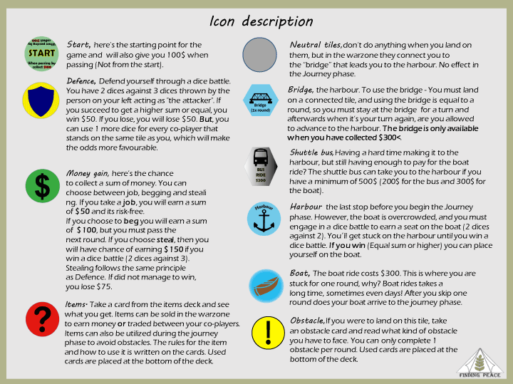
Along with the iteriations and mechanic design of the rules and its compnents, was I designing icons for the different tiles, game cards and had a hand on the game board as well, all to put it in context of our topic and consistency of the design.
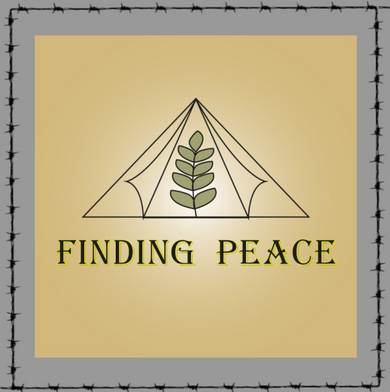
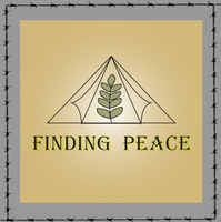
It wasn't until the end of the project the game got a name, Finding Peace became the name for our game, we voted democratically within our group. I must say to give such a game like this a name was hard!
The project ended with a presentation(you can see the presentation here) of the game for World beyond war and our mentor.
The game got a bit out of the theme but still managed to find it's own place.
The game became much better than we believed at the beginning of the project, and it became really appreciated by World beyond wars.
It is now both playable on the steam platform and also as a print and play version.
It will now work as a central role in several human rights modules World beyond war hosting at Irish schools for example during world refugee day.
Info:
Customer: BetChill AB.
Duration: 3 weeks.
Team: Solo job.
Role: UX/UI-Designer, Researcher, user-tester.
What i did:
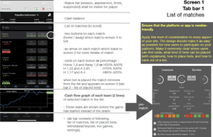

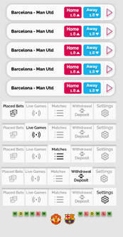
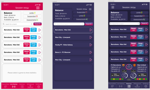
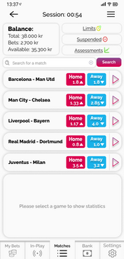
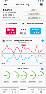
Created these slides as the UI-concept for the betting platform.
I used the same font as the company uses on their website for consistency in the brand.
I chose two colors with alot of contrast which would draw more attention and in that way feel hype.
I strongly dislike the top area with all the buttons and overwhelming information, but I had to include them accordingly to rules and legislations.
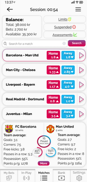
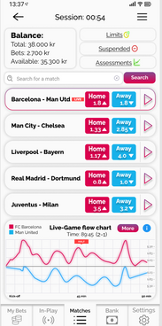
I used Figma to create the UI. I created an interactive melt-in navigation bar at the bottom of the screen, and I also did an general highlighting mechanic which allows the user to easily locate themselves inside the app.
wireframed, prototyped and conducted user testing, and made design decisions with the user in focus.
The company got very pleased with the end product.